Greetings, reader! This post highlights new design features we’ve added to our article pages. It includes something for every platform we publish on, but focuses on our website in particular. To see it all in action there, check out this post on our site.
If you’ve read a story on ProPublica.org recently you may have noticed something a little different. A few weeks ago we quietly took the wraps off a new design for our article pages, one that makes big improvements to the experience for our readers, and creates a rich new set of possibilities for presenting our journalism.
This is a complete overhaul, and includes just as much under the hood as it does in the parts you can see. It also builds off the great work our design and platform team has been doing the last few years to extend every aspect of ProPublica’s mission on our site, as well as platforms like Apple News where you’re just as likely to encounter our reporting.
Meet Our New Story Page Design
The first thing you’ll notice is a dramatically simplified layout, featuring a more focused main navigation. It cuts away the noise but keeps the most relevant parts of our site just a tap away.
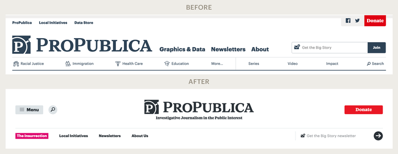 Our main navigation has been streamlined to work better on both desktop and mobile devices.
We’ve also created a beautiful new set of opening layouts. We know how important first impressions are, so we’ve taken great care to build a coordinated set of designs that lets every story put its best foot forward. Behind the scenes, our publishing system presents our staff with a set of options to customize how the first screen of a story looks and works. That also includes a dozen optional color themes, which automatically coordinate with the other elements on the page, like links, buttons, backgrounds, messages and banners.
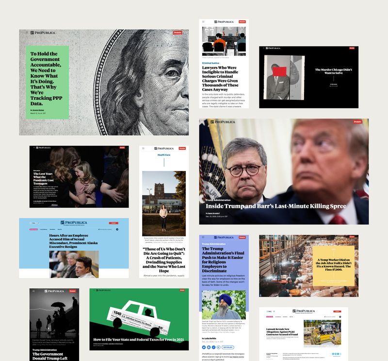 New settings include flexible options for opening layouts.
Speaking of colors, we also took the opportunity to add support for the “dark mode” option available in many modern operating systems. It does what you’d expect, respecting your operating system preference by default but letting you switch to light or dark whenever you want, and it remembers your choice for later. Enabling features like this is an important part of respecting our users’ preferences.
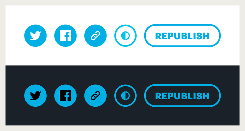 You can now toggle between dark and light mode using a button that appears next to our other story tools.
Lower down on the page our stories have moved to a simpler, centered layout. Because we’ve dropped the right-hand column from our design, we can now use content that’s any shape or size at any point in our articles. That also frees us up to deploy more modern advertising and promotional units. Combined with the next generation of our internal layout system, we can accommodate a range of new visual storytelling options.
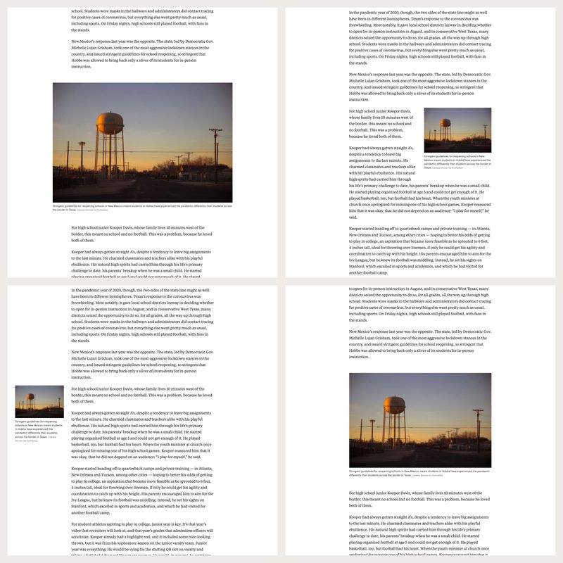 A single-column layout and upgraded layout system give us more flexibility in how we use various types of media in stories.
We’ll have more to say about that layout system upgrade — and code to share — in a follow-up post.
The Right Content for the Right Context
Content for our stories comes in all shapes and sizes, and creates opportunities for engaging presentations. But it also makes it a challenge to provide consistency when publishing the same article across the many platforms we support, like desktop and mobile web browsers, news aggregator apps, social media, and more.
So we’ve added tools to make that easier for our team, like automating the creation of all the different images needed for each device and platform while still keeping the subject of the photo visible in the frame. All they have to do is tell our CMS where the focal point of an image is and it takes care of the rest.
 Intelligent cropping lets us keep a photo’s subject in view even as the page resizes.
That’s pretty neat, but automatic formatting doesn’t get you everything. What about when the technical requirements of a different device size calls for an entirely different piece of content? That’s where our new publishing controls come into play.
Say one of our story producers has an image that looks great in a desktop web browser but is illegible when it gets squished down into a mobile screen. Our new tools make it easy to specify different images for mobile and desktop.
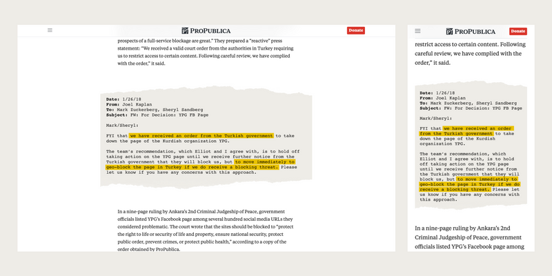 New controls allow us to specify how images appear on desktop and mobile devices.
The same goes for entirely different platforms. If we have a piece of multimedia that makes sense for our website but not the Google AMP version of an article, all we have to do is toggle the corresponding switch on that content in the CMS and it won’t display on AMP — but it will still appear on our website, right where we want it. We can even take things a step further by adding some alternate content that only appears for AMP users.
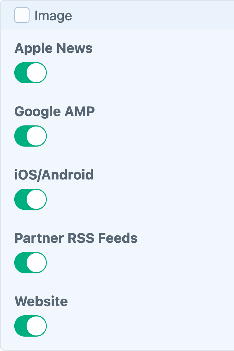 Those same controls let us decide exactly where each piece of content appears.
Easier, Smarter, Faster
To help ease the burden on our copy and visual desks, we also put real effort into figuring out new ways to automate away the more mundane tasks required to create a story in our CMS.
For example, we built a new tool that automatically places the promotional modules, advertisements, and other bits of repeating, preformatted content we need to appear in each story. Everything follows an easy-to-program set of display rules, and can be overridden instantly by our staff without adjusting any code. If a story producer wants a module like an ad to appear in a different spot, all they need to do is place one manually and the automation stops. There are no buttons to press. The system detects what they’ve done and responds accordingly.
We think this is a tool other sites can benefit from, so we’ll be releasing our code as an open source plugin later this year.
We also focused our energy on making story pages load quickly. We’ve gone over our code with a fine-tooth comb, overhauling the most important parts and ditching outdated bits. We reduced the number of network requests our pages make on first load by 50%, and the page weight by 40%, without reducing interactivity or graphics — in fact, quite the opposite.
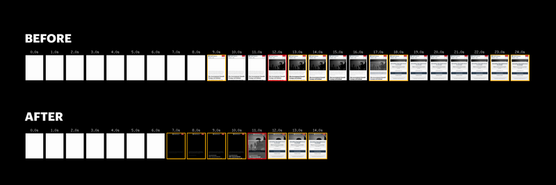 Our new article page design loads faster and uses fewer resources.
(Results from WebPageTest)
The result is a page that’s markedly lighter and faster to load in our readers’ web browsers and devices. We consider it one of this update’s most important design features.
More to Come, and Thanks
We think these improvements give our article pages a versatility and visual richness that are unique among news sites.
All this good work is the result of the talent, dedication and hard work of the staff here at ProPublica. We also had some important collaborators along the way. We’d like to thank the teams at Funsize for helping us get our initial design thinking rolling, Happy Cog for coding the automations described above, and Solspace for implementing our most complex CMS template ideas. We’d also like to thank the indefatigable Jesse von Doom for helping us mind our schedules and keep our project running on time.
We’ll have more posts in the coming weeks that will dive deeper into different aspects of this work. In the meantime, happy reading!
